A consistent campaign is not created by placing the same logo on everything. It comes from making a small number of clear decisions early, then applying them thoughtfully across formats with very different sizes, materials and production requirements.
A pull-up banner viewed across a room cannot carry the same detail as a brochure held in someone’s hand. A promotional pen has far less decoration space than a tote bag. The aim is not to make every item identical, but to make every item recognisably part of the same campaign.
Start with a campaign system, not a collection of products
It is tempting to begin by listing what needs to be ordered: flyers, signs, shirts, drink bottles and perhaps a few social graphics. Before choosing products, define the campaign system that will connect them.
A simple system should cover:
- The main message: The one idea people should remember.
- The primary action: What should they do next, such as visit a website, scan a QR code, register or speak to a team member?
- The visual anchor: A distinctive colour, image style, graphic shape or pattern that can work across multiple formats.
- The information hierarchy: What must be noticed first, second and third?
- The campaign period: Whether materials are for a single event, a seasonal promotion or longer-term use.
This short framework becomes the reference point for every design and production decision. It also helps prevent extra messages being added until the campaign becomes crowded and difficult to recognise.
Create a practical artwork toolkit
A general brand guide is useful, but campaign production often needs a more focused toolkit. This can be a short document or organised artwork folder containing the approved elements for that specific campaign.
Include primary and secondary logo versions, colour references, approved typefaces, campaign graphics, image files, icon styles and examples of correct layouts. Supply vector artwork for logos and graphics wherever possible, along with suitable high-resolution images.
It is also worth defining what can change. For example, local contact details might vary between locations, while the headline, colours and offer remain fixed. Clear rules make adaptation easier without weakening consistency.
Use sensible file naming
Confusion often starts when several files are called “final”. Use names that identify the campaign, item, size, version and date. A file such as “WinterCampaign_A3Poster_V4_2026-04-10” is much easier to manage than “Poster_Final_New”.
Keep one approved source folder and move old versions into an archive. This reduces the chance of a superseded offer, date or QR code returning later in production.
Design for distance, size and purpose
Each format has a different job. Consistency should not come at the expense of usefulness.
Signage needs immediate recognition
For banners, window graphics and outdoor signs, prioritise a short headline, strong contrast and one clear action. Fine details that work in a brochure may be unreadable from several metres away.
When reviewing signage, look at the artwork at a reduced size or step back from the screen. If the main message disappears, simplify it. Also consider the physical setting: obstructions, viewing direction, lighting and the amount of time people will have to read it.
Printed material can carry the detail
Flyers, brochures and information cards can explain the campaign more fully. Use the same headline style, colours and imagery as the signage, then add supporting information in a clear reading order.
A useful approach is to let signage attract attention and let printed pieces answer the next questions. Repeating every paragraph on every item usually creates clutter rather than consistency.
Promotional products need restraint
Decoration areas on merchandise can be small, curved, textured or restricted by the manufacturing method. An intricate campaign lock-up may reproduce well on a tote bag but poorly on a pen or keyring.
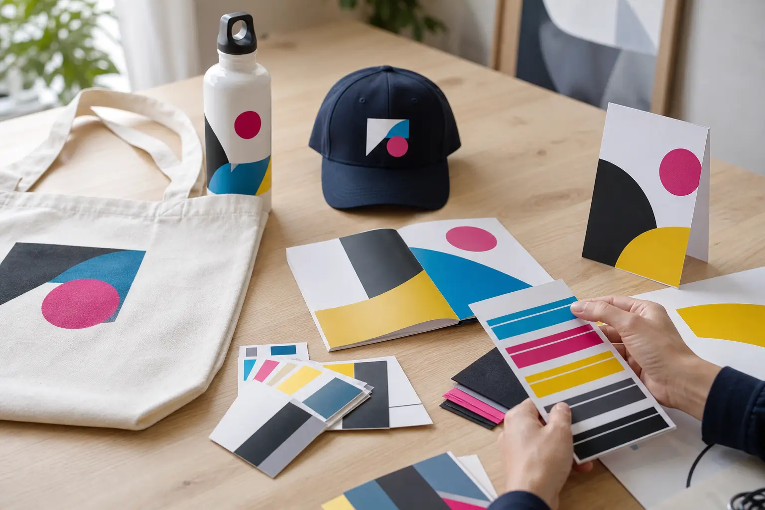
Prepare a simplified campaign mark for smaller items. This might use the logo, a short line and one graphic element rather than the complete design. Select products that suit the campaign’s audience and setting, not simply products with the largest decoration area.
For example, an event campaign might combine prominent entrance signage, a concise takeaway card and a practical branded item used during the event. Each piece has a different role, but shared colours and graphic elements connect the experience.
Expect colour to behave differently
The same colour can appear different on coated paper, uncoated stock, fabric, vinyl, metal and plastic. Screen colours also do not directly represent every printed result.
Provide recognised colour references where available, but discuss how those colours will be produced on each item. Some products may use full-colour printing, while others use spot colours, embroidery, engraving or another decoration method. The base material also affects the result.
The practical goal is a controlled, recognisable colour family across the campaign. When an exact match is not possible, an approved alternative should be chosen deliberately rather than discovered after delivery.
Build repetition around a few recognisable cues
People do not need to see the complete campaign design every time. Repeating two or three distinctive cues is often enough to create recognition.
These cues might include:
- A particular colour combination
- A bold diagonal shape or border treatment
- A consistent photographic style
- A repeated short headline
- A simple illustration or icon set
- A consistent call-to-action panel
Choose elements that can survive being enlarged, reduced, cropped or reproduced in one colour. If the campaign depends on one complex image or a long block of text, adapting it across products will be difficult.
Proof the campaign as a group
Individual proofs can look correct while the overall campaign still feels disjointed. Review key items together before approving production.
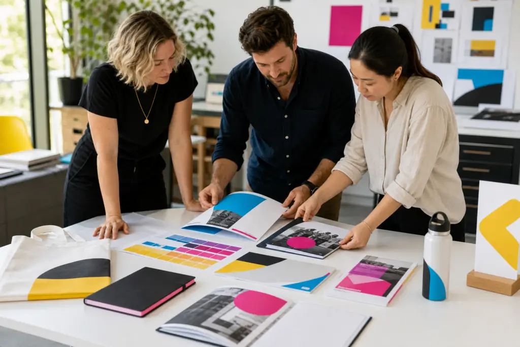
Place the brochure, sign, apparel artwork and promotional product visuals side by side. Check whether they share a clear visual relationship and whether each item performs its intended job.
During this review, confirm:
- Headlines, dates, contact details and offer wording are consistent
- Logo versions and clear space are correct
- Colours have been specified appropriately for each production method
- Images have sufficient resolution for their finished size
- QR codes and website addresses have been tested
- Small text remains readable
- Finishing, installation and packing requirements are documented
- One authorised person has provided final approval
If several people need to review the campaign, collect their comments before sending revisions. Separate rounds of conflicting feedback increase the risk of mismatched versions.
Plan production before the creative work is finished
Production considerations should shape the campaign early, particularly when signage and promotional merchandise are involved. Product dimensions, print areas, material choices, finishing methods and delivery needs can all affect the artwork.
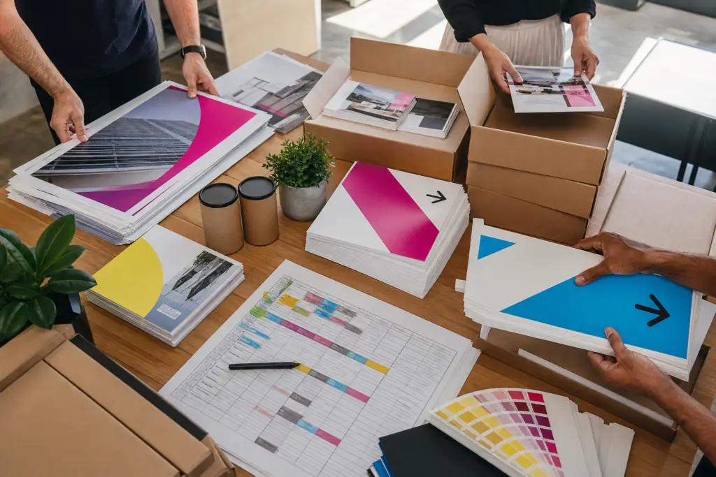
Start with the fixed date, such as an event opening or campaign launch, and work backwards. Allow time for product selection, artwork adaptation, proofing, production, packing and delivery. Avoid treating every item as if it follows the same production path.
All Aces Printing can support campaigns from concept through design, production and delivery across print, signage and promotional products. Bringing these elements into the conversation early makes it easier to identify technical conflicts and keep the finished campaign connected.
A consistent campaign is easier to recognise and easier to manage
The strongest multi-format campaigns use a clear central idea, disciplined artwork and realistic adaptations. They do not force a brochure layout onto a banner or squeeze a detailed design onto a small promotional item.
Define the message, create a campaign toolkit, assign each format a role and review the pieces together. That approach produces materials that feel related wherever people encounter them, while still allowing each item to do its job properly.
Talk to the All Aces team about your next project Get in touch with us.