The strongest campaigns are not the ones that place the same artwork on every available surface. They are the ones where each item has a clear job, while the overall experience still feels connected.
A banner may need to catch attention from 20 metres away. A flyer can explain the detail. A promotional item should remain useful after the event or campaign has finished. Forcing identical content onto all three usually results in crowded signs, vague flyers and merchandise nobody wants to keep.
The better approach is to build a simple campaign system: one central idea, a clear visual hierarchy and artwork adapted for the way each item will be seen and used.
Start with the action you want people to take
Before selecting products or discussing finishes, decide what the campaign needs to achieve. A useful objective is specific enough to guide design decisions.
For example, an organisation preparing for a community open day might want people to:
- Notice the event while passing the venue.
- Understand what is happening and when.
- Find the correct entrance on the day.
- Take home contact details or a useful reminder.
Those are four different communication tasks. They may call for outdoor signage, an information flyer, directional signs and a practical giveaway. Thinking in tasks rather than individual products helps prevent unnecessary ordering.
A campaign item earns its place when it helps someone notice, understand, navigate or remember.
Create a small set of campaign essentials
You do not need a complicated brand manual for every short campaign. A one-page creative brief can provide enough structure for designers, organisers and suppliers.
Include the following essentials:
- Primary message: the single idea people should understand first.
- Call to action: what they should do next, such as register, visit, enquire or attend.
- Priority details: dates, locations, contact information and any essential instructions.
- Visual cues: approved colours, typefaces, imagery and logo versions.
- Tone: whether the campaign should feel welcoming, premium, energetic, practical or community-focused.
This brief also makes approvals easier. Instead of debating personal preferences, reviewers can ask whether each piece supports the agreed message and action.
Design for viewing distance and attention span
Artwork that looks clear on a laptop screen can fail once it is enlarged, installed or viewed in a busy environment. Each format needs its own information hierarchy.
Signage: recognition first
People often see signs while walking, driving or looking across a crowded room. Lead with one short message and make the essential information easy to identify.
A roadside sign advertising an open day may only need the event name, date, location cue and a short call to action. The complete schedule belongs elsewhere. Strong contrast, readable type and uncluttered spacing generally matter more than squeezing in another sentence.
Printed material: explanation second
Flyers, brochures and handouts can carry more detail because the reader can hold them and choose to spend time with them. Use headings, short sections and clear next steps rather than one dense block of copy.
Printed material is also a good place for information that people may need later, including opening hours, service summaries, maps, event programs or contact options.
Promotional products: memory over detail
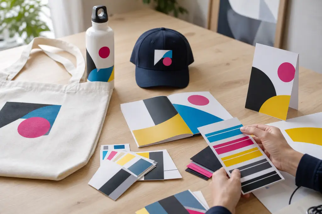
The printable area on merchandise is often limited, curved or interrupted by seams and product features. A logo, short campaign line or simple graphic will usually work harder than a miniature advertisement.
Consider the setting as well. A tote bag may suit an event where visitors collect information. Drinkware could be useful for staff or ongoing community programs. A notebook may fit a conference or training session. The closer the item is to the audience’s real needs, the more likely it is to remain in use.
Keep the family resemblance without making clones
Consistency does not mean every item must share the same layout. It means the campaign uses recognisable elements in a controlled way.
You might use the same main colour, headline style and image treatment across a banner, flyer and tote bag. The banner could feature a large headline, the flyer could expand on the details, and the tote could carry only the campaign graphic and organisation name.
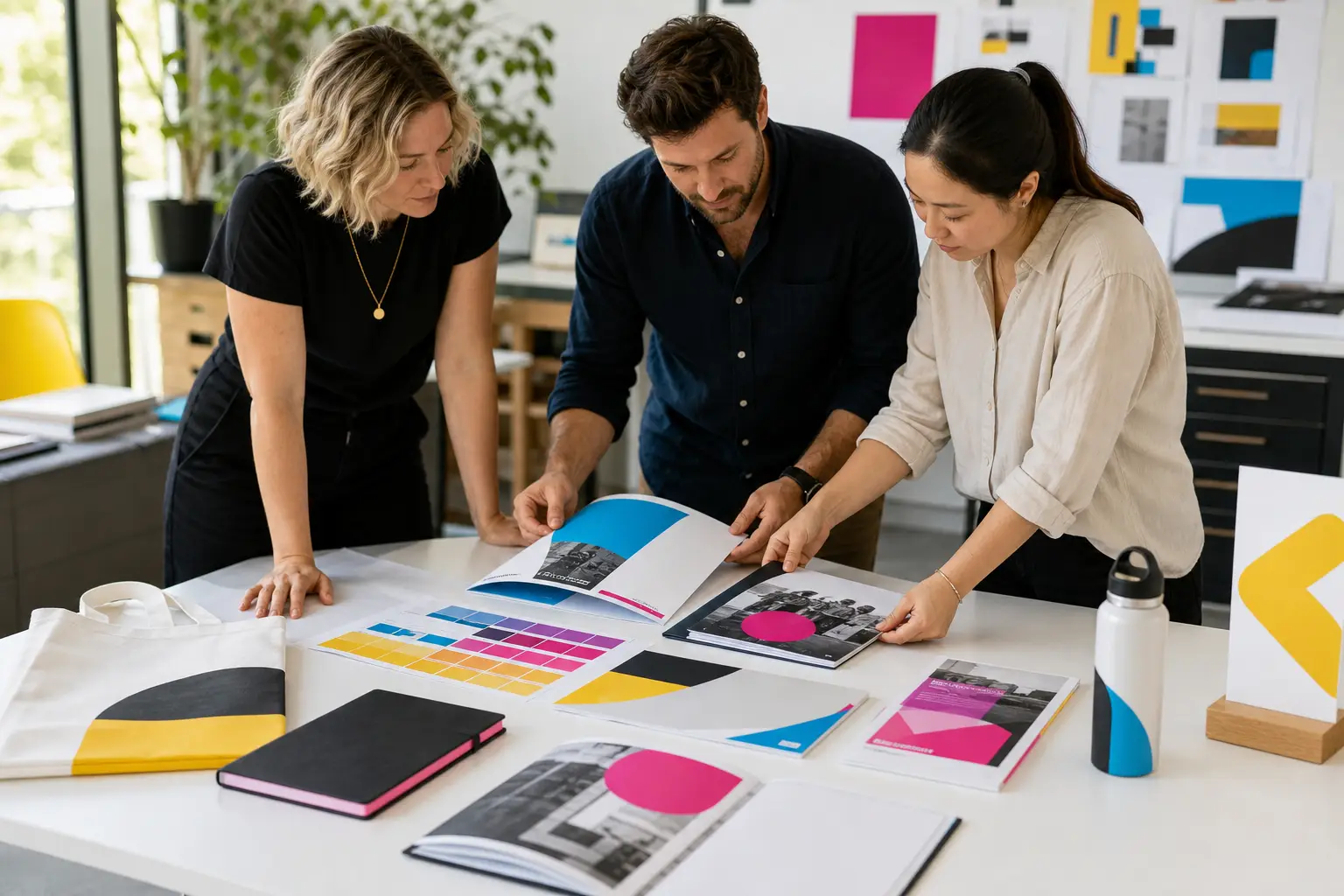
A simple way to check consistency is to place proofs of all campaign items side by side. They should look related, but each should still make sense on its own.
Account for production before approving the concept
Different products have different artwork requirements. A design intended for paper may not transfer neatly to fabric, rigid signage or a small promotional item.
Check practical details early, including:
- Whether supplied logos are suitable for enlargement.
- How colours may appear across different materials and production methods.
- The available decoration or print area on merchandise.
- Whether signs require bleed, margins, eyelets, stands or other finishing considerations.
- How folds, trims, handles or seams may affect important artwork.
- Whether variable details are needed across different pieces.
This is where early production input can save considerable reworking. With more than 20 years of experience across design, print, signage and promotional products, the All Aces Printing team can help assess how a campaign idea will translate before everything reaches final artwork.
Build approvals around content, not just appearance
A proof should be checked by someone who knows the campaign details, not only by the person responsible for design. Slow down for dates, phone numbers, web addresses, locations and calls to action.
Use a final approval checklist:
- Confirm the correct logo and campaign version are being used.
- Read all copy at the size shown on the proof.
- Check dates, times, addresses and contact details against the original source.
- Confirm dimensions, quantities, materials and finishing.
- Check that small type remains practical for the intended format.
- Review the full set together for inconsistencies or missing information.
- Confirm delivery details and who will receive or distribute each item.
Avoid approving proofs through a long email chain with conflicting comments. Nominate one person to consolidate feedback and provide the final decision.
Plan the campaign as one project
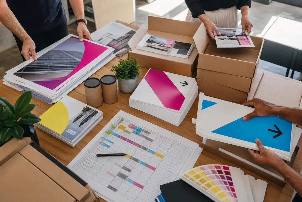
Ordering signs, printed pieces and merchandise separately can create duplicated work and inconsistent decisions. Planning them together gives you a clearer view of what is essential, what can be simplified and where artwork needs to be adapted.
It also helps with sequencing. Venue signs may be needed before installation, flyers before distribution and promotional products before packing or event setup. Working backwards from the date each item must be in use is more reliable than applying one deadline to the whole campaign.
All Aces Printing supports Australian organisations from concept through production and delivery, with production capability in every state. Bringing the complete campaign into one conversation gives the team the opportunity to identify gaps, flag production considerations and help keep the finished pieces connected.
The goal is not to put your logo on as many things as possible. It is to give each audience touchpoint a purpose, then make those touchpoints feel like parts of the same well-planned campaign.
Talk to the All Aces team about your next project Get in touch with us.